All work

Concept study · self-initiated · 2026

Halden Claims Console

A work queue for revenue-cycle teams that turns payer rejections and denials into a clear next action — instead of a code to look up.

This is a self-initiated concept. The product, organisations and data are fictional; the design problems are real.

Role
End-to-end product design
Type
Self-initiated concept
Platform
Desktop web, keyboard-first
Focus
Density, triage, error states
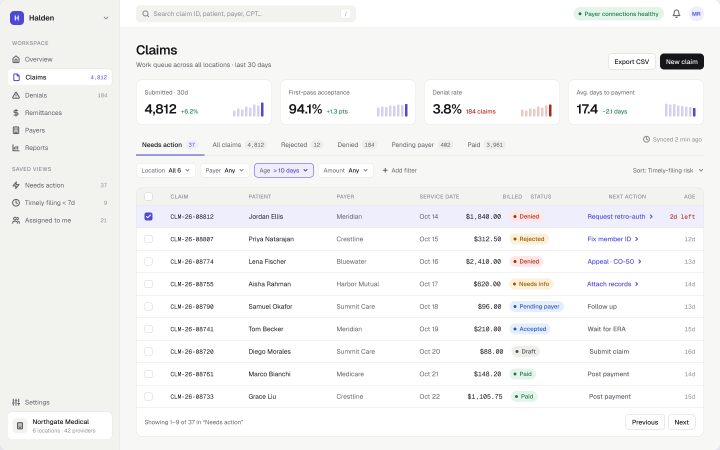
Halden Claims Console — main screen

Context

The problem and the bet

The problem

Billing specialists work thousands of claims a month across a dozen insurers. Denials arrive as reason codes (CO-197, N54) spread across portals and reports, so triage depends on tribal knowledge and spreadsheets — and money is lost to deadlines nobody saw coming.

The bet

If every claim told you what to do next — and why — specialists would spend their day fixing claims instead of finding them.

How I’d validate it

Shadow 3–5 billing specialists during a denial-work session, then test the queue and the explainer with a clickable prototype against their current tools.

MR
Maya, billing specialist
Proto-persona · assumption-based, to validate

Goals

  • Clear the queue before filing deadlines
  • Know why a claim was denied without searching code lists

Frustrations

  • Jumping between insurer portals, reports and spreadsheets
  • Finding out about denials weeks after they happen

Journey

Where the product steps in

EncounterClaim built03SubmittedAdjudicated01Denied02Fix & resubmit04Appeal06

Numbers refer to the chapters below. 05 — the command palette — works across every step. 03 feeds back into how claims are built, so fewer are denied in the first place.

01 · Triage

The work queue

Get a specialist from login to the most urgent fix in one click.

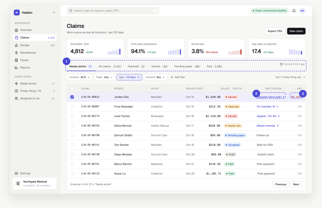
The work queue — annotated screen
1

Default to “Needs action”, not “All claims”

Most claims need nothing from a person. Opening on everything buries the few that do, so the default view is the actionable subset, with counts on every tab.

Considered insteadStatus-only tabs — rejected: a status doesn’t say what to do.
2

A “Next action” column written as a verb

Each row answers “what do I do now?” without opening it. Codes stay in the detail view for experts who search by them.

Considered insteadShowing the denial code in the list — precise, but needs a lookup every time.

3

Sorted by filing-deadline risk

Money lost to a missed deadline can’t be recovered, so urgency beats age or amount. The deadline is the only red text in the row.

Considered insteadSort by amount — the biggest claim isn’t always the most urgent.

02 · Explain

Claim detail

Explain a denial in plain language and turn it into a guided fix.

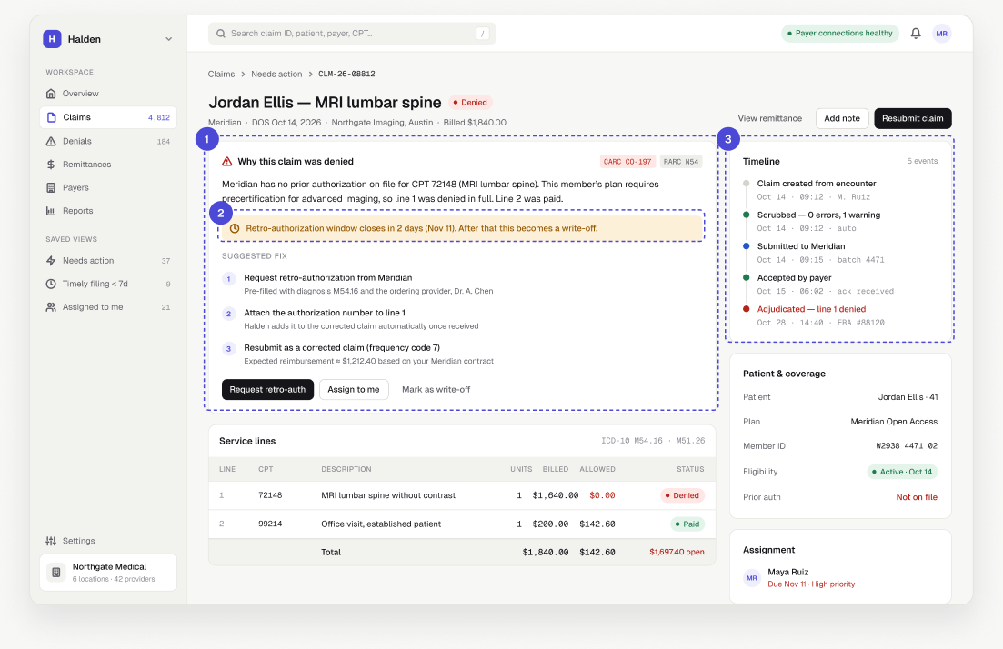
Claim detail — annotated screen
1

The sentence comes before the code

The explainer leads with cause and consequence; reason codes sit alongside as tags, so experts lose nothing and newcomers aren’t lost.

Considered insteadA tooltip on the code — hides the answer behind an interaction.

2

Deadlines stated with their consequence

“2 days left — then it becomes a write-off” makes the priority self-evident without a separate priority field.

3

A timeline of every hand-off

Most disputes are “who had it last?” — clinic, clearinghouse or insurer. A visible timeline settles it in seconds.

Considered insteadA separate activity-log tab — accurate but rarely opened.

03 · Prevent

Denial insights

Help billing leads fix the causes, not just the claims.

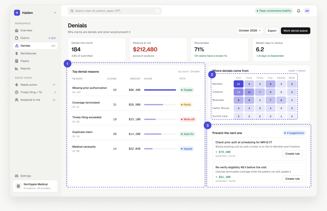
Denial insights — annotated screen
1

Every reason has a path

Fixable, appeal or write-off: leads see where effort pays back before assigning work.

2

Insurer × reason heatmap

Patterns are insurer-specific. A matrix makes “one insurer drives most auth denials” visible at a glance.

Considered insteadStacked bars per insurer — hard to compare one reason across insurers.

3

Insight becomes a rule, with its impact

Dashboards rarely change behaviour unless the next step is one click away. Each suggestion shows the money it would have saved.

04 · Fix at scale

Bulk resubmit

Let specialists fix dozens of claims without creating new rejections.

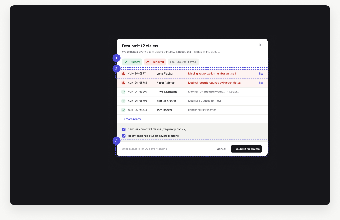
Bulk resubmit — annotated screen
1

A preflight check before anything is sent

Resubmitting a broken claim triggers a second rejection and wastes days. Every claim is checked first and the result is summarised.

2

Blocked claims explained inline, with a fix

Partial success beats all-or-nothing. Blocked claims stay in the queue with the reason attached.

Considered insteadDisabling the whole action until every claim is valid — blocks good work.

3

Undo instead of “Are you sure?”

The button states the real outcome (“Resubmit 10 claims”) and a 30-second undo replaces a confirmation people click through.

05 · Speed

Command palette

Make expert, keyboard-first work fast without adding UI.

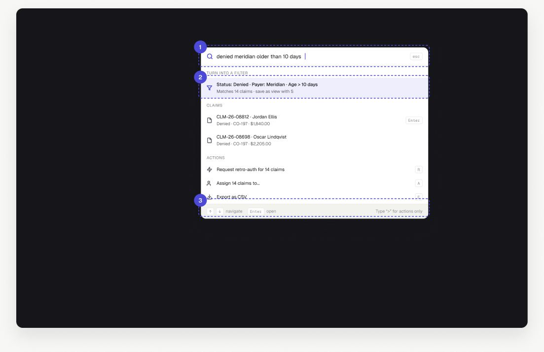
Command palette — annotated screen
1

One search for claims, patients and actions

Specialists work in the tool all day. Typing intent is faster than navigating menus.

2

A query can become a saved view

Power users build their own queues from plain language — no filter builder to learn.

Considered insteadA dedicated advanced-filter screen — powerful but slow for everyday use.

3

Shortcuts taught in context

Hints next to each result are learned through use, not from a help page.

06 · Recover

Appeal composer

Turn a strong case into a complete appeal on the first try.

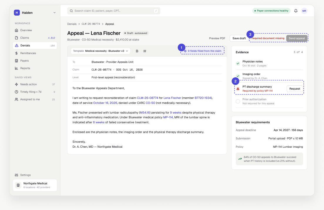
Appeal composer — annotated screen
1

Pre-filled, and visibly so

Claim data fills the letter and is highlighted, so the author checks the generated parts instead of retyping them.

2

Evidence checklist driven by insurer policy

Missing documentation is the most common reason appeals fail. The checklist comes from the insurer’s policy, not a generic template.

3

Disabled with a reason, not hidden

People see exactly what blocks them. Sending with a warning was rejected: a weak appeal can’t be redone.

Considered insteadAllow sending with a warning.

Trust

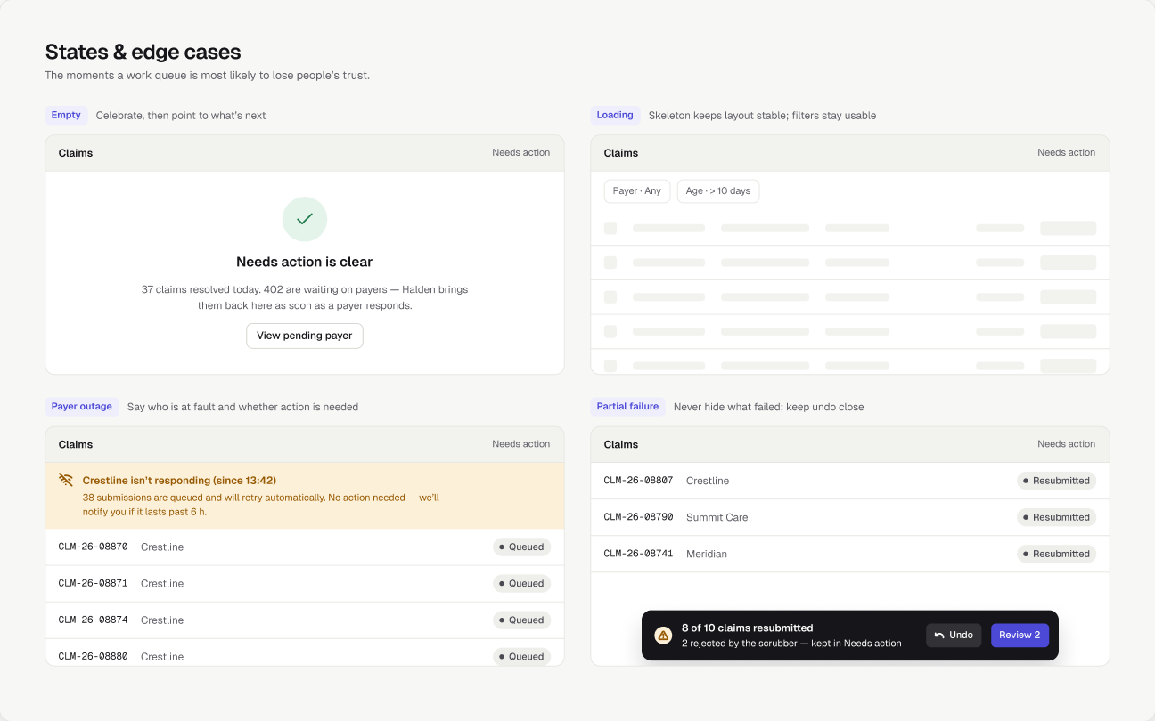
States & edge cases

Empty, loading, outage and partial failure are where a work tool earns or loses trust. Each one says what happened, whose problem it is and whether action is needed.

Empty, loading, error and partial-failure states
System

Rules behind the interface

Small, explicit rules keep a dense interface consistent as it grows.

Status never relies on colour alone

Every status pill pairs a tone with a dot and a label (WCAG 1.4.1).

Denied · Rejected · Pending · Paid

Identifiers are monospace

Claim IDs, member IDs and codes are easy to compare and copy.

CLM-26-08812

One red per row, at most

Red is reserved for what costs money if ignored — deadlines and denials — so it keeps its meaning.

2d left
Outcome

Measuring it, and what’s next

As a concept, this has no live numbers — so here is what I would measure and test first.

How I’d measure success

  • First-pass acceptance rate
  • Median time from denial to resubmission
  • Denials worked per specialist per day
  • Revenue lost to missed filing deadlines

What I’d test next

  • Next-action queue vs status tabs, in a moderated test
  • Comprehension of plain-language explainers vs code-first layout
  • Whether preflight warnings are read or dismissed
  • Which prevention rules leads actually turn on