Fields highlighted as they’re read
People can see what was captured and check it before anything is saved — scanning feels verifiable, not magic.
Concept study · self-initiated · 2026
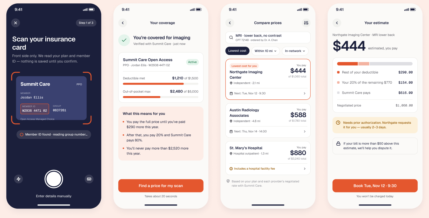
A mobile flow that tells patients what a scan will actually cost them — before they book — and checks the bill afterwards.
This is a self-initiated concept. The product, organisations and data are fictional; the design problems are real.
Context
The same MRI can cost $400 or $1,200 depending on where you go, and insurance terms hide what you’ll owe. Most people book where they’re sent and find out the price weeks later.
If people see what they will pay — in their own numbers, before booking — they’ll choose lower-cost care and trust the result, as long as the estimate holds up.
Test comprehension of the estimate with 6–8 insured adults (“how much will you pay, and why?”), then compare estimates to real bills in a pilot.
Journey
Numbers refer to the chapters below. Most cost tools stop at the estimate. Clearcost follows through to the bill — which is what makes the estimate trustworthy.
Get insurance details in without asking people to understand their card.
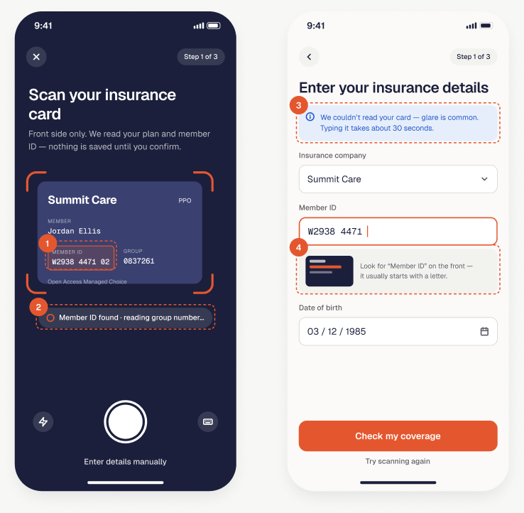
People can see what was captured and check it before anything is saved — scanning feels verifiable, not magic.
No shutter to time: the app captures when the card is readable and says what it’s doing.
Considered insteadA manual shutter — more control, more blurry photos.
“Glare is common” and “about 30 seconds” set expectations and keep people moving.
A mini card diagram shows where the member ID lives, instead of a help link.
Make deductible and coinsurance mean something to someone who’s never had to know.
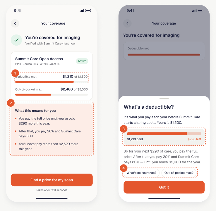
“$1,210 of $1,500” is easier to act on than a percentage or a term.
“What this means for you” states consequences in the person’s own numbers.
Tapping any insurance term opens a sheet that reuses the person’s plan data.
Considered insteadA glossary page — accurate, but abstract.
Related terms appear as chips so people go deeper only if they want to.
Help people choose where to go by what they’ll pay.
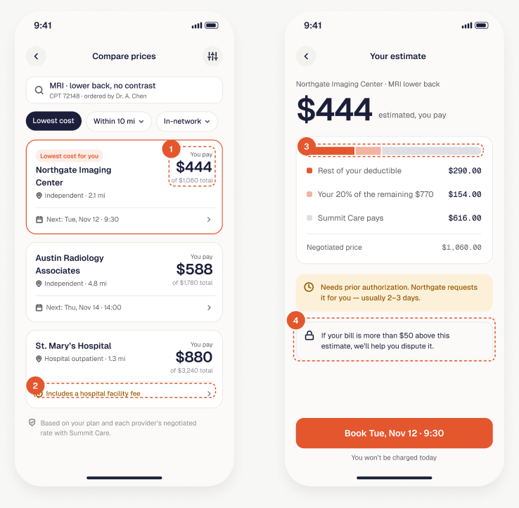
The personal number is large; the negotiated price is secondary. That’s the order people decide in.
Considered insteadSorting by distance — the map default, but cost is the question.
A hospital facility fee is flagged on that card, not in a footnote.
Deductible, coinsurance and insurer share in one stacked bar make the estimate checkable at a glance.
A price lock turns an estimate into something people can rely on — and creates the bill check later.
Reduce the anxiety between booking and the appointment.
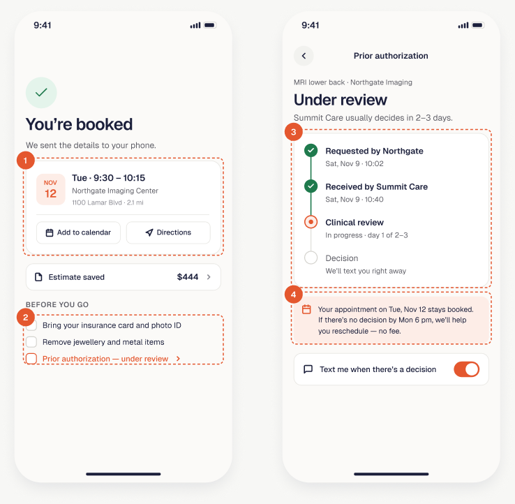
Time, place, directions and calendar — the questions people have on the morning of the scan.
The pending prior authorization sits in the checklist and links to its tracker.
A step tracker with timestamps turns an invisible insurer process into visible progress.
Saying what happens if there’s no decision removes the biggest worry: losing the appointment.
Keep the promise after the visit, and never leave people at a dead end.
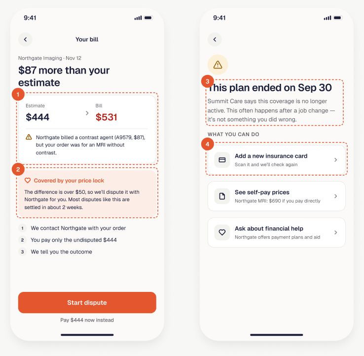
Clearcost reads the bill when it arrives and explains any difference line by line.
Above $50 of difference, the product starts the dispute and lets people pay only the undisputed part.
An ended plan is explained in plain words, with the likely reason.
Considered insteadA generic “coverage not found” error.
A new card, self-pay prices or financial help — the person can still get care.
Small, explicit rules keep a dense interface consistent as it grows.
Every price shown to a patient is their share first; totals and insurer amounts come second.
You pay $444Insurance words appear only next to the number they describe, and are always tappable.
$290 left of your deductibleEvery waiting state and every error ends with the next step and who takes it.
We’ll text you right awayAs a concept, this has no live numbers — so here is what I would measure and test first.